
Color for Business:
Color as a Productivity Tool
Color is a subjective or objective topic depending on the context. It can be a casual or technical discussion, changing the conversation dynamic from “just use blue” to, “which blue HEX code?” When it comes to using color for business, we’ll focus on how to improve user productivity and experience simply based on color.
Color in Business
If you ask yourself, “what does color have to do with business?”, you may initially think about branding, company logo colors, document uniformity, your website, marketing content, or other color-related dynamics.
However, color can have a much more meaningful impact on business. It can change how employees feel at work, affect their productivity, and even make the learning process more accessible.
“People make a subconscious judgment about a person, environment, or product within 90 seconds of initial viewing and between 62% and 90% of that assessment is based on color alone.”
–CCICOLOR – Institute of Color Research
Memory and Color
As previously mentioned, color can be leveraged to influence human moods and modify behaviors. There has been much research conducted about color psychology, and the chemicals released by our brain when our eyes perceive color. In a published study by the Malaysian Journal of Medical Sciences, researchers conducted an experiment to determine the influence of color on memory performance.
“First is the consistency of the colors used during encoding and retrieval phases. This means the color used or presented during the time when participants are asked to memorize, should be the same with the color shown to them at the time of retrieval. This rule is in line with the encoding specificity principle, which highlights the close connection between these two memory processes, encoding, and retrieval in determining the memory performance. The greater match of conditions in these two processes, the better the retrieval outcome.”
Living colors appeal more to our brain and increase memory retention. This is why we tend to remember experiences in natural environments more vividly.

Based on the provided evidence, and going back to the initial question, we can start drawing relationships between color, memory, and productivity.
At Smartbridge, we have designed many applications for a variety of industries. Though a popular perception is a particular industry is related to only a certain color, our team understands the uniqueness of each client. We don’t boil down the color selection to the traditional norms. We go beyond expectations by digging into the client requirements and user experience.
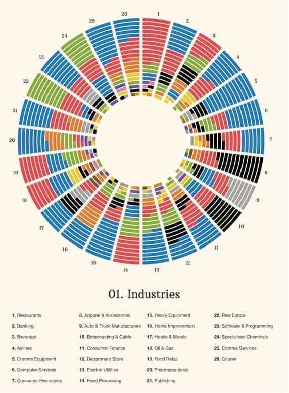
With our Digital Innovations services, we ask ourselves a series of questions going into every project. What is the purpose of the application? How does the user experience need to be? Would colors affect performance or productivity?
Color in User Interfaces
As user experience/user interface designers, one of our responsibilities is to determine the best displayed colors on your mobile device, tablet, or desktop. I, of course, take into consideration the company’s branding and incorporate those colors as required. However, color can be used throughout the UI to impact how the user reads and processes information.
Color relationships or combinations are without a doubt complex. The variations of value and intensity will change the relationships we perceive. Strong, intense colors increase excitement, while weak colors build calmness and tranquility. One example is a situational awareness and crisis management solution we built.
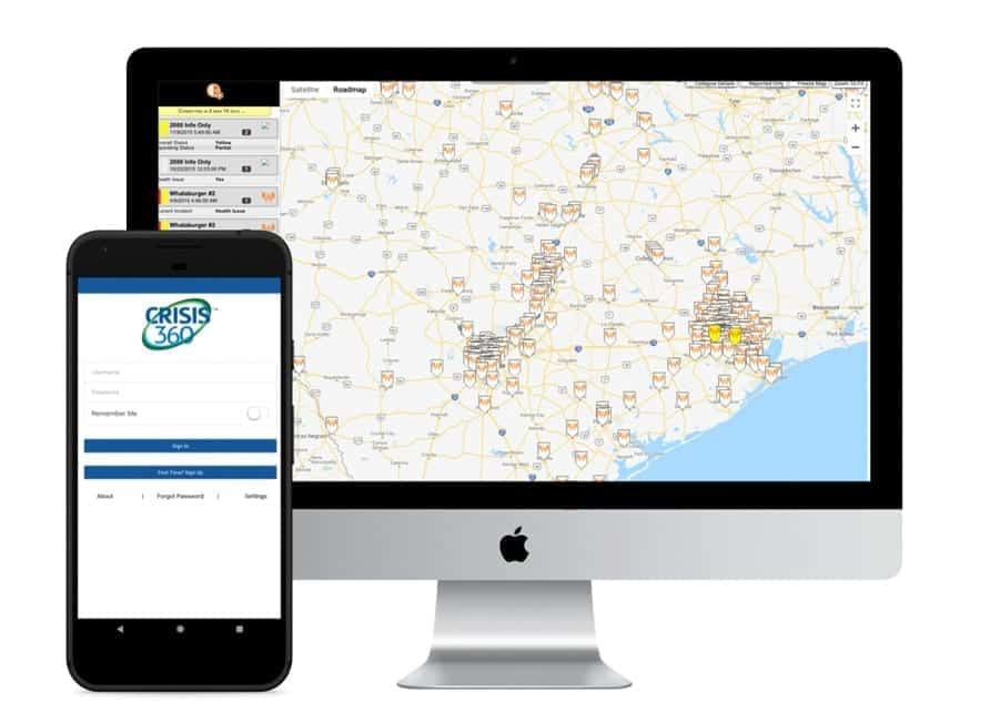
The app was a comprehensive emergency and incident management tool that allowed businesses to have real-time updates on operations, entities, and users during a crisis. A crisis can vary from a hurricane, fire, flood, or an industry-specific crisis, such as food contamination, power outages, or other life threatening situations.
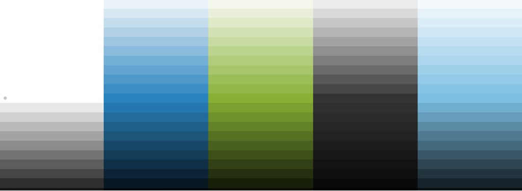
The objective of the app was to help users make decisions calmly and confidently, using accurate data from first responders regarding the incidents. That’s why the following color palette was chosen throughout various mobile user interfaces:
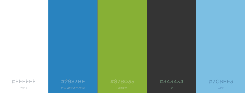
Here are the color associations our brain makes regarding each color:
Since these are complex applications, we often need more colors for different parts of it. This is to avoid user confusion and prevent a plain-looking mobile application with a limited color palette. Color shades are employed, giving more options to designers and developers to accent or contrast UI elements, without having too many colors on the screen.
Without adding more stress to the user dealing with the crisis, the color palette provides the decision maker with a neutral tool that does not bias the severity of the crisis.

So as you can see, color plays a major role even in our everyday applications. It’s not only important but also useful to understand the psychology behind color, especially in business settings.
Keep Reading: The Art of Problem Solving in Business
There’s more to explore at Smartbridge.com!
Sign up to be notified when we publish articles, news, videos and more!
Other ways to
follow us: