Hybrid Cloud Management with Power BI
As Microsoft’s Power BI continues to evolve with each monthly update, we are seeing it transform into an even more powerful business intelligence tool. We will discuss how we used Power BI connectors to create a dashboard where we can manage hybrid cloud costs.
Hybrid Cloud Architectures – The Movement
Today, many businesses already know the importance of data, and they have made great strides to invest in their future by embracing a data-driven model behind making business decisions. Depending on the business need, some companies may choose to use on-premise systems but a large majority are moving to the cloud. The power behind this movement is the very popular pay-as-you-go pricing model that many cloud providers have adopted. This provides flexibility and scalability at a very reasonable price, which is very attractive to both small and medium-sized companies where a large investment into on-premise systems can be a bit daunting.
This model also allows the user to pick and choose what they need, such as only purchasing storage and virtual machines or purchasing ETL capability without having to necessarily store anything. Where it gets interesting is when companies decide to use a hybrid cloud architecture.
What this cloud solution brings to a company is the diversification of their cloud platform in order to eliminate business risk and maintain high reliability on their systems (see Smartbridge’s experience in cloud integration). With the introduction of multiple cloud platforms, keeping track of the individual and aggregated costs for each cloud platform gets more and more time-consuming.
Picture this: Let’s say that the quarterly company meeting is coming up, so instead of working on a new development, an analyst will have to spend some time scouring through old data in order to create a report on the last three month’s total cloud cost. That is a time-consuming but necessary task! Some of these cloud platforms have great out-of-the-box cost management systems, i.e. AWS Cost Explorer or Azure Cost and Billing, but they run into the same issue where these interfaces are locked into each individual cloud platform.
Using a business intelligence tool like Power BI, we can set up cost data from these different cloud platforms to be ingested. To capture the data, we can use Power BI’s extensive repository of native connectors to consume and customize the cost data.
Leveraging Power BI to Bring Visibility to Hybrid Cloud Costs
Power BI is a very powerful business intelligence tool created by Microsoft for data analytics and reporting for thousands of users and companies. By taking advantage of its large selection of connectors, connecting to Azure, AWS, or Snowflake is as easy as a couple of clicks. For this blog’s example, I used cost data from both Azure and Snowflake.
In order to get to the data model shown below, some M-Code was used to massage the data from the two different sources as they have different standards and some conformity was in order. After the data has been normalized to the desired grain, the data can now be analyzed.
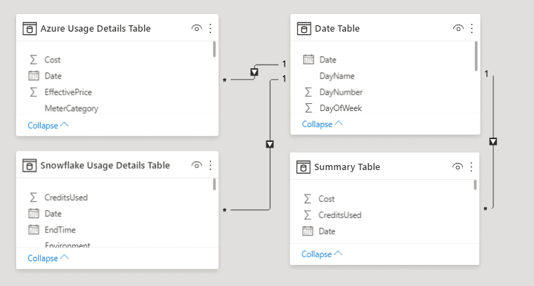
Figure A shows the data model in Power BI for this cost management dashboard. Four tables are created: one for each cloud platform, one date table and one summary table.
One Dashboard – Unified Visibility of All Cloud Costs
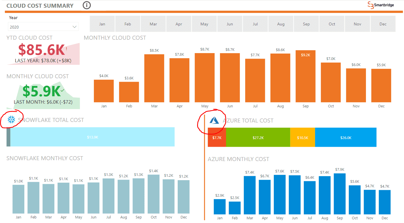
Figure B shows the landing page for the cloud cost dashboard.
The first view of this dashboard is showing a summary view of the cost data obtained from these cloud platforms. This view is meant for an executive audience who wants to get a pulse for how the business is doing without diving into an extensive search through daily metrics. In the lower section, we see both Azure and Snowflake data, while the top portion is aggregating both to show totals along with a year-to-date and monthly key performance indicator. This view already provides more clarity on how much is exactly being spent on the cloud as a whole rather than what one might be able to find in a specialized interface locked for one cloud platform.
While this shows data at a higher level, the need to drill down to investigate the root causes of some costs will be forever present. Using Power BI’s bookmarks, I created an intuitive way to reach the reports shown in the upcoming images which can be reached by simply clicking on the platform’s logo (circled in red above).
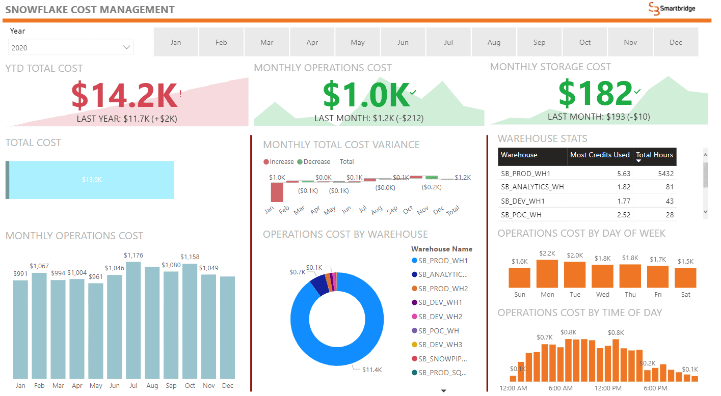
Figure C shows the detailed drill down into Snowflake cost data
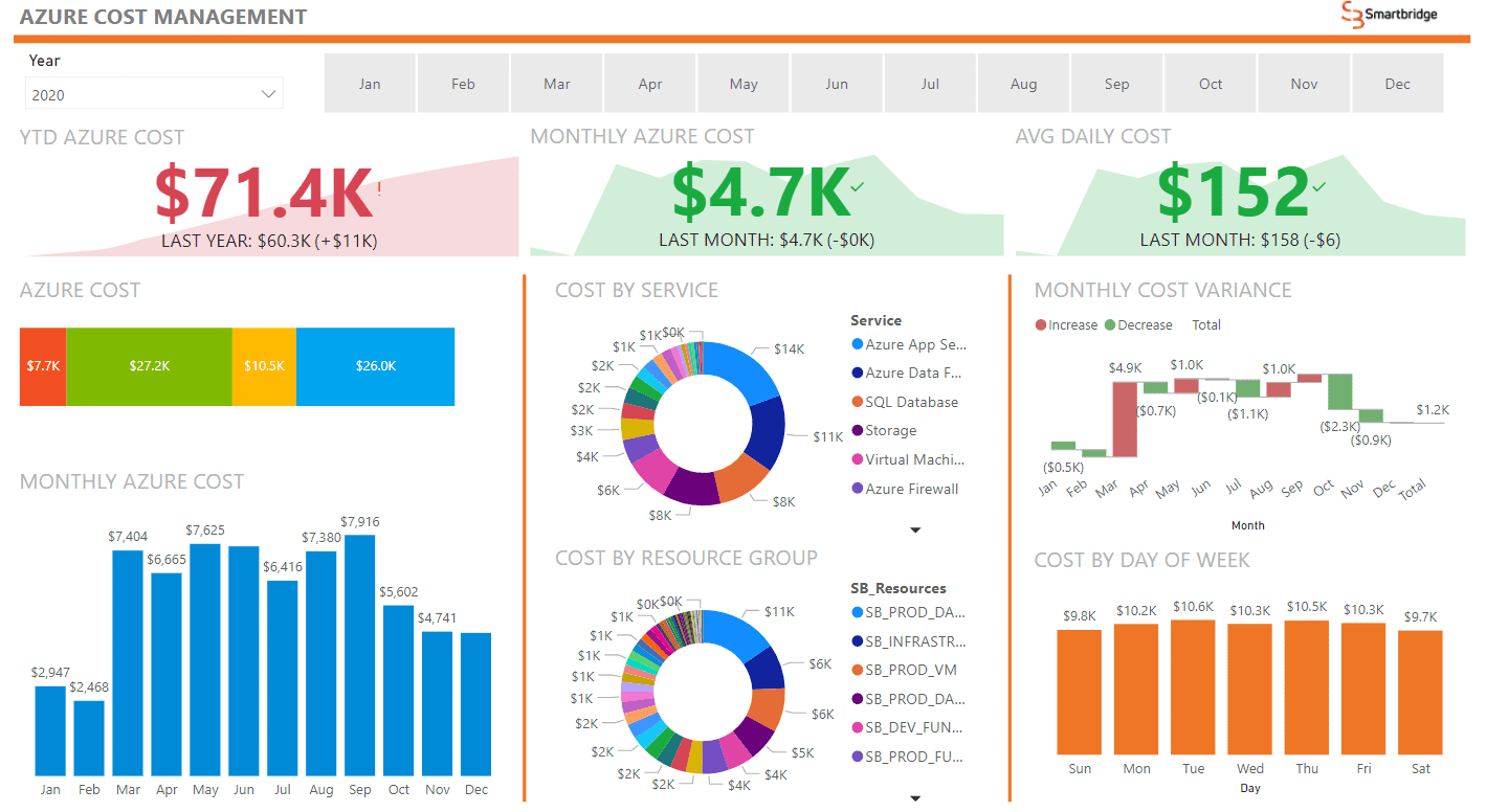
Figure D shows the detailed drill down into Azure Cost Data
The images above show the pages once you click on either the Snowflake or Azure logo respectively. As you can see, the visualizations are a bit different depending on the data available and the ways in which the data is tagged. For instance, one section that was kept similar across the reporting in both platforms are the key performance indicators which are reported in a yearly or monthly metric along with the ability to slice data by month. These views are intended for analysts who may have to dig a little deeper into what is causing a certain cost.
Hybrid Cloud Management
This short overview of the cost management dashboard is only a sneak peek into what Power BI can do with its extensive use of connectors. Separate from its integration capabilities, Power BI also has a wide scope of security protocols ensuring that only the correct individuals have access to this sensitive information. Power BI also has distribution capabilities to ensure that the report is up to date and current. Going back to the scenario we talked about earlier, we can now see how having all cloud cost data in one central, automated dashboard can bring cost clarity to an ever-growing complex cloud solution.
Keep Reading: How to Incorporate Azure ML Output to Power BI
Looking for more on data & analytics?
Explore more insights and expertise at Smartbridge.com/data
There’s more to explore at Smartbridge.com!
Sign up to be notified when we publish articles, news, videos and more!
Other ways to
follow us:


